Got It: An App for Struggling Apprentices
Client
- BCIT Digital Design and Development/ConnectHer
Timeline
- September 2025—December 2025
Role
- UX Designer
Team Size
- 7 members
Development
- VS Code, React.js, React bits, API calling
Software
- Google Drive, Google sheets, Google Doc, Figma, Adobe Suite, Jira
Brief
Level 1 electrical students at BCIT, particularly those who are neurodiverse, face significant challenges with retention and are at higher risk of leaving the program before completing their Red Seal certification.
What was the result
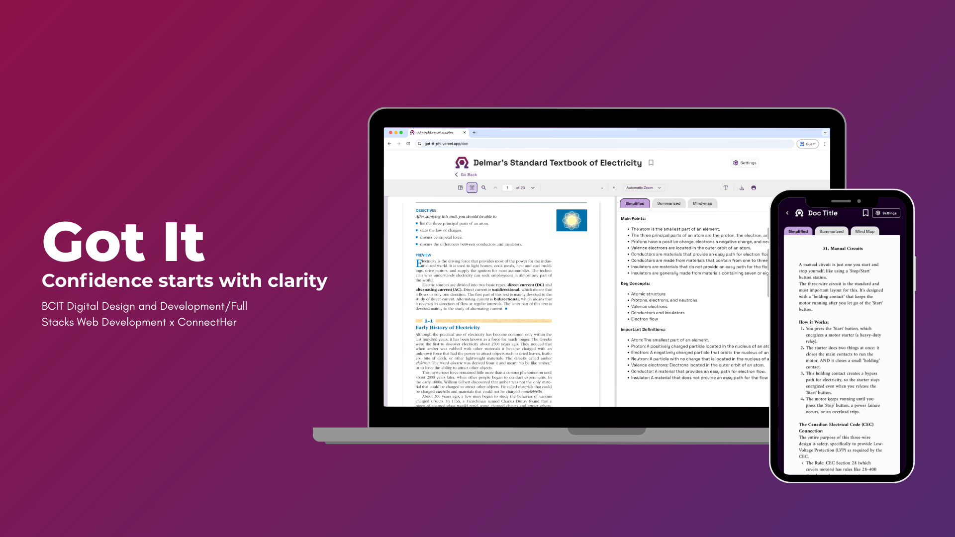
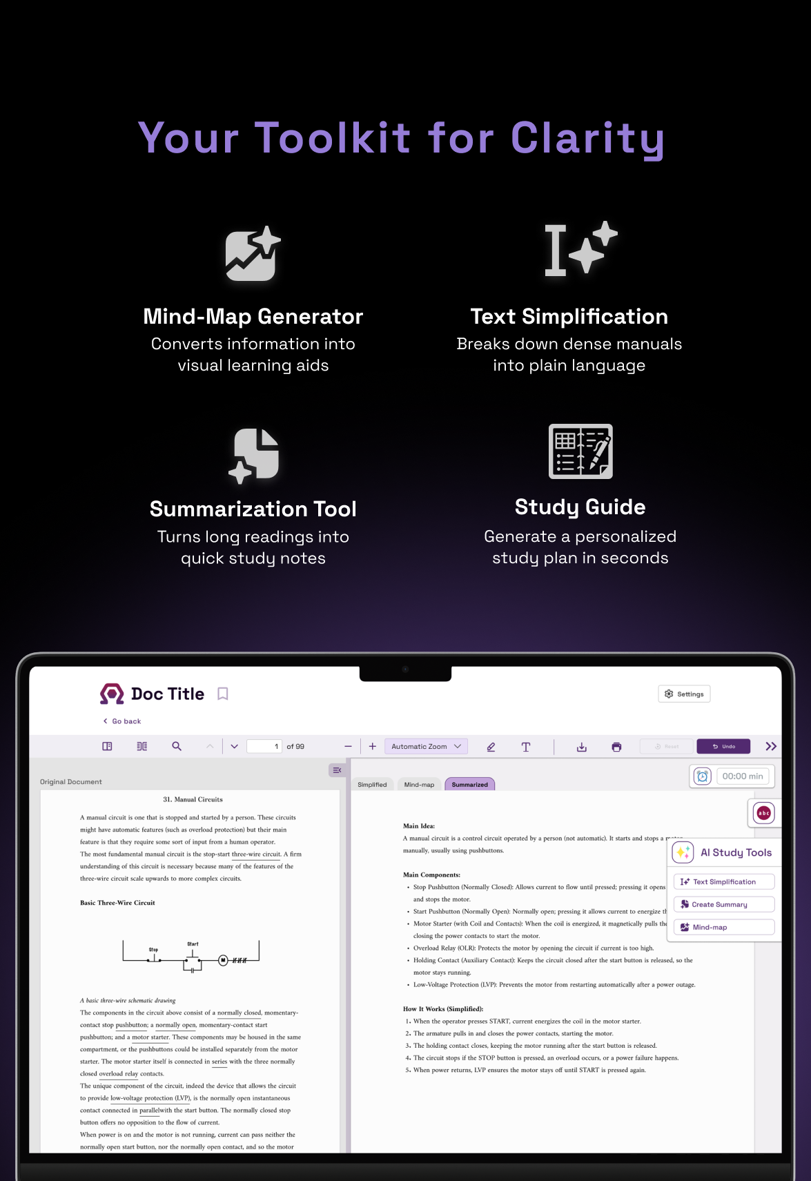
We developed a webapp that help neurodiverse electrical apprentices turn dense study materials into accessible, easier-to-understand learning content. It lets students upload their own documents or open built‑in textbooks, then uses AI tools to simplify text, generate summaries, and create mind maps so they can quickly see the “big picture” and key points.
This was the process
Key Findings
My research exposed a gap between how neurodiverse electrical apprentices learn and how content is delivered. They struggle with dense, text-heavy materials and often make their own visual or hands-on supports, showing a need for guided, multimodal learning. I proposed a tool with visual aids, plain language, flexible modes, and accessibility features.
Digital Comfort and Textbook Barriers
| Aspect | Detailed Findings | Evidence/Examples | Impact on Neurodiverse Learners | BCIT Context |
|---|---|---|---|---|
| Digital Comfort |
| Survey: Laptops top device at 100%; phones/iPads secondary | Strong foundation for web-based solutions; reduces adoption barriers | BCIT Level 1 electrical apprentices comfortable with digital but need guided interfaces |
| Textbook Barriers |
| Participant quotes: "Dense text harder to absorb"; "No images = crazy not productive" |
| Program materials (e.g., Delmar's chapters) prioritize text over multimodal aids, misaligning with neurodiverse needs |
Study Organization Struggles and Coping Strategies
| Struggles | Coping Strategies | Evidence & Impact |
|---|---|---|
Difficulty starting and organizing complex material
|
|
|
Participant Quotes from Survey
| Issue | Quote Excerpt |
|---|---|
| No breaks/examples | "In every part only have text without images is test reading 4 chapter Delmar's and 2 questions on 40-go show and when 0% on the test... all the boring + chapter is most difficult and 1-2" |
| Dense presentation | "The more dense the text it (and English) the harder it is to absorb. Bold font for important words, images of concepts, empty space on the page... that helps" |
| Lack of visuals | "Without visuals or example/sample questions... just crazy it not useful/productive" |
Accessibility Gaps and Specific Pain Points
| Gap Category | Specific Pain Points |
|---|---|
| Institutional Services |
|
| Content & Language |
|
| Learning Resources |
|
Recommended Tool Solutions
| Solution Category | Specific Features | Purpose |
|---|---|---|
| Visual & Comprehension Aids |
| Reduce cognitive overload from technical jargon and dense text |
| Learning Flexibility |
| Support multimodal processing and varied study environments |
| Navigation & Organization |
| Enable quick access, personalization, and on-demand reference |
 Results from User Survey
App Concept Overview
| Purpose | Key Benefit |
|---|---|
| Consolidate fragmented study methods into one platform for neurodiverse learners | Integrates textbooks with accessibility features; eliminates tool-switching |
Core Features
| Category | Features |
|---|---|
| Study Tools |
|
| Editing & Navigation |
|
Like what you see?
Let's make something amazing and usable that people actually love to use, because great design should feel effortless and meaningful in everyday life.